Sunday, November 11, 2012

Fall Still Life (Process and Details)

Something has to be said about patience, space and the careful study they allow. My family was kind enough not to mind my month-long take over of the dining room, and so I transformed it into a make-shift studio. I had done still life studies before, but it had always been a matter of drawing whatever was before my eyes already. A journalistic sort of approach of noninterference with the objects of study. And then of course there had been arrangements set up by the teachers in the past. Setting up your own still life is an entirely different animal. Every single object, material  and color that will end up as part of the painting is your explicit decision. Every shadow, highlight and angle. You aren't adapting your frame of view to the rules of composition, but gardening the composition in its entirety. And then of course, each object will inevitably be infused with personal meaning, even if you aren't going for any sort of explicit metaphor. It took me a couple of days only to set up the arrangement, and on the photos below you can see a couple tripods and a monopod came in very handy for securing the drapery. 


Working on a painting a week after week is a meditative, lulling experience, that transforms your habitual way of looking. Beauty of even the most mundane surfaces becomes overwhelming. Your mind continues to analyze and paint, even when you don't have a brush in your hands. And the boundaries of realism become incredibly vast. That is to say that you become very aware just how determinant your choices are to the look of the painting. It may look "realistic," but what an oversimplification that is. You are still, even within realism, essentially choosing between one abstraction and another. You think about parameters that dictate the optical reality before you, eliminate a great deal and emphasize a great deal. You coerce the paint to conform to the shapes you model, once you know how it moves, mixes and reacts. 


Practically speaking, another thing comes into play: keeping acrylics active and wet for this long is only possible with an addition of a retardant medium. It makes a world of difference. Your brush will glide, the paint film will still dry fairly quickly, but it stays buttery for long enough to actually work the paint layers and not just patch them one on top of the other. This let me achieve the foggy look of semi-transparent liquid in the wine glass and the striations in the horn pipe from Ollantaytambo.


There isn't a doubt in my mind that realism in painting is a mighty force. Considering it a relic copyist method is simply blind. Ability to accurately relay physical reality of objects in your field of vision is only the beginning, and even that is already an inherently intimate outpouring of the artist's mind. Even as a record of the artist's analysis and decisions, a well orchestrated piece cannot escape from being something mystical and elusive--a connection, an address, a plea for comprehension and harmony, a pocket of reality where laws of physics swap partners. Materials become illusions and thoughts become actualities.

Here is a step by step slideshow of the entire four-week painting session. 


Friday, August 3, 2012

Tuesday, July 24, 2012

Flowers in a Vase (Step by step)


You can tell at this point the leftmost leaf is rather flat. More needs to happen in that green to bring out the convoluted relief. I still have two to three days to put into this. This isn't a situation where you can establish the painting in totality and then bring out detail evenly throughout the scene. The plants wilt before you get to do this, inevitably, and you cannot go any faster with the delicate layering. So the image for now is a bit fragmented. More than delivering exactly what is before you, you are forced to analyze the plant's form - what repeats, what is unique to each leaf, and be able to combine them in a seamless image.

Pineapple

Since the days of art school came to a close, I have been selectively purchasing art instruction books in search of technique advice and some sense of art dialogue. And I mean very selectively. The great internet transformation of all habits made it possible to research art books, as though this were an innovative new gadget one is seeking to buy, not so much a treasure one randomly comes across in a store. A book I found particularly helpful from just about cover to cover is Botanical Portraits with Colored Pencils by Ann Swan

Color pencils are a tricky medium. They lend themselves equally well to spectacular realism and spectacular failure. Simply by being the toy art supplies of children or creators of fan art, who have perhaps that genuine spark and love for the act of drawing, but hardly any sense of form yet, let alone exposure to supplies of quality, pencils forgive and encourage grainy unfinished doodling. They are really not ment for that type of sketch though, if one can judge a medium for where it shines at all. I have used them so, for sketching, and provided that the paper surface is not overly toothy, it appeared a worthwhile method to jot down the moment, spontaneously and with some suggestion of color - psychochromal most often rather than realist. It's useful. But color pencils really shine in form building and painstaking reiteration of color detail.

Ann Swan's book made me realize the possibilities, explained the behavior of pencils themselves (soft or sharp point, prone to breaking or not, fugitive of color fast, etc.) and paraded in front of me work that takes this method to the very edge. And so, I finally felt equipped to tackle color space. No need was there to change my hand movements or deal with the beautiful but disarming accidents of water media, or stubborn delicacy of brushes. Here was the same old pencil, just in color.

And here is my first experiment:


It was odd eating this pineapple. when I was finished with its portrait. I had gotten to know it so well over the several days, biting into it felt bizarrely special.

Saturday, June 23, 2012

Your hands

A wooden crate, a wheel, a handle make sounds of rainstorm
for a baroque theater in a Czech town, featured
on a morning travel special. How fascinating and far away,
and unstoppably displaced by other information. Ads
lean on the beauty, on orthopedic masterpiece,
on the unfathomable satisfaction through simple and unrelated means, and even
voice of critique and disbelief is claimed before you have the chance to think it.
The latest advertisements are self-aware, you see, and function on a meta level.
But trade is what we do.


Outside there's grass cutting through earth,
and tree heights competing for the sunlight,
angiosperms, delicate organs and fierce stems all on display,
their blood of substances that nourish, derange, kill and enlighten.
A well-established habit, a cup of coffee
is quenching overmedicated wonder. All falls into place,
your microscopic agony subsides, and caffeine fulfills you.
In the evening, it will be the properties of wine
and new inhabitants in castles of your eyes. The nebulae,
the supernovae, the radial arrangement of smooth muscle.
The windows to your immaterial yet highly guarded acres, fertile with self.
And overtaken for a moment by a grape, then wheat, then flesh.
You are a person to love behind all this, despite all this, because of this.
A distinguishable pattern embedded in the rock of everything,
endowed with agile perfection and miraculously, will.


The thicket of symbols is as dense as this summer air;
you can move your hands around, and drag logic along with humid Lorton.
Particulate, like pixels in a damaged video download
cascading squares hopping about a strange attractor
our thoughts grow circular. But kernel process, love, stays untouched.
Symbols cannot deform it, poemsrelay it, customs
confine it, chaosdegrade it, wishesembalm it.
Your hand is warm, pulse and meat, and mitochondrial pre-history…
and feeling, intent gesture. Your hand is warm, care and breath, oxygen flow
with no syntactic sence, trickling throughout your body. It beats.
You are warm. The angles of your eyelids speak endearment. It is sweet to see.
Calm looks away… at those horizon edges
egging you on daily. We sigh at instances, two occurrences enmeshed into what happens.
Cosmic blinks, we take a second to unite and decompose,
we take an eon to make up our minds and come about into coherent form.
But like roots that have become their path, we're ours,
and nothing can undo us.


Some would declare the fact that I say "us" means something subconscious -
such scaffolding of theory; advice columns to market, medication sales.
Those substances that nourish and derange, enlighten and extinguish:
the very pigment of a feeling clasped in common sense and served, seasoned
with molecular derivatives, but mostly, simply words.
I wish they'd leave my words alone, the "us" alone,
us alone, uninterpreted, uninterrupted, unexplained,
amid the roots entangled and fungi in embrace, exchanging selves,
vines ascending upward, kudzu disseminating its engulfing being,
spider-veining urban growth and economic noise, and architecture
eroding into its stature as heritage, a symbiont with the graffiti caked into cement,
the bones, the real sounds of thunder, the ceremonial and the practical, delightful, blunt and nuanced,
waring, stripped of meaning, repackaged, reinvented and unearthed and left alone,
and under fog, risen out of stardust and doomed along with all,
your hands holding mine, offering me you.

Monday, June 18, 2012

Testing Out Watercolors

Somehow every time I decide to do something in color, it ends up being heavy on green. But to be fair, it is a very green summer. On this daytime, the scene was lit by very bright sun, and I was surprised that simply laying yellows over the underlying colors brought in that sunny brightness. From my reading on watercolor, I've gleaned little factoids; like, apparently, Alizarin Crimson is a staining and fugitive pigment and should basically not be used at all. But for now that's a little over my head. I am simply getting the feel for the medium, trying to get it to listen to me, like the tame pencil does. Thinking immediately in color and shape is one thing, but most importantly I am waiting for the moment when I will have confident handwriting with brushes. Still I am finding myself doing a lot of pencil-like scratching, which I feel is "mine" and also a bit dangerous for the paper. This is Canson watercolor paper. Probably not the toughest out there and it wasn't stretched. But it survived. Didn't warp or tear. I will try stretching the paper next time, and see what that changes.

Charlottesville, Virginia  6/17/2012

Sunday, June 10, 2012

Sketches of Home

On second thoughts, forget scanning.  I'm moving on to posting photos with all their distorted angles, and only I shall have the perfect proprietary original ;). Anyway, here are some home-themed sketches. I'm sorry these are in hard pencil and you have to strain your eyes. I can't explain why, but I like them that way. It has something to do with the process - how pencil feels on paper - and with how private and intimate this makes the drawing. You have to look close. They aren't really meant for the contrasts of internet, but here they are nonetheless.


But okay, by now I've had enough of timid penciling and want to do something bolder. The garden bird bath and my dog on the couch are two relatively quick sketches done in Faber Castel PITT Big Brush pens. It's almost unfair how quickly four grades of grey establish all the values you need, while pencil demands that you labor on shadows for hours. But detail is of a different caliber. Here things are blocked off haphazardly. There is no detail to speak of really. It's a quick impression, and it emerges from the page, while you work on it, in a way that's like slow motion photo developing process in a dark room (if anybody remembers those days).

Saturday, June 9, 2012

Larger Format and Big Ideas

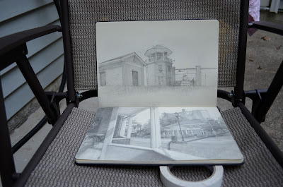
I have not posted any updates in a long time. But I have been drawing! Here is a small sample of sketchbook pages from... well I guess last Fall till now. I will need to get around to a scanner to get them all. These are done in a Moleskine Folio Sketchbook, which does not take ink at all, but has a delicious feel when working with pencil. Marker ink seems to work alright, and I have yet to try a Rapidograph. But no washes with this paper - it just ends up with droplets beading up and ugly soaked paper towel look. If anybody knows what exactly about paper processing causes it, please tell me. 

Moving to a slightly larger format for sketches has pushed me to spend more time on each drawing. In fact the boundary between sketch and drawing proper is not entirely clear cut. I love the meditative sinking in the drawing process, but some quick spontaneity is important to keep on hand. 

Waqar Studying

Charlottesville, VA

My Father. Topological Craziness of the Ceramic Teapot.

Lorton Prizon Tower. Views of Charlottesville #1.

Views of Charlottesville #1 (up close)


After a semester-long hiatus from art for the purposes of studying cell biology and anatomy, and working, I am now embarking on a summer of art, full force. To warm up I started with teapot drawing, moving away from the light touch feel of hard pencil (which I still dearly love) to a fuller value range. I know everybody loves drama, but I am partial to a subtler look.

After spending seven hours on reflections in the teapot, I found myself returning to the same spot on Main Street in Charlottesville for three days, for four to five hour drawing sessions, and then reworking the drawing at home as well. This is the reason why truly developing a body of work is a full-time job. With this drawing I am just finally getting a feel for where I want to go with my tools and my peculiar views on drawing as Alternative Journalism.

Views of Charlottesville #1 (so you can actually see it)


Apart from actually grasping the scene, which is a bizarre obsession in itself, there is one thing, one question that I keep rolling over in my mind: will the meditative reiteration of a scene, will realism, will my handwriting betray an emotion? There were days when I drew emotions directly, or through some sort of personal psychosymbolic lore. It seems a completely boring path now, far too trivial for emotions that would probably not even be caught on the radar of a teenage mind, mine at least.

Yet there is no lack of drama in the subtler unfoldings of life. In fact it is the realm where most mystery exists. It's a realm of earthy steady heartbeat, or the fall of a leaf, or the softness of moss, or the carving of canyons. It's a terribly patient species of human experience, and to evoke and investigate that, I do not see any other way than to trust the process. To trust that the thought will be recorded in the marks that otherwise describe some very specific forms before my eyes.


Casa Peruana Revisited


After a long time, I pulled this piece out from the file to see if I can bring it to completion. It seemed too constrained in feeling and empty. The entire shadowed-house region just seemed devoid of life and stuck on as an after-thought. Something needed to flow and give depth to the scene without breaking its slightly-off melancholy. I realized I needed to stop treating the pencil drawing as so precious and just go ahead and paint over it in a messier way, to build some age to the walls, some fractals to the stones and sky.

Noting how much bold lines add to an otherwise perfectly self-conscious form building in my images of trees, I realized that the armature of unfinished buildings that populates Peruvian cityscapes is a perfect candidate for such lines. And to have an etherial sort of plastic bag stuck on the armature, catching wind, like a trashy flag of our times -- I thought that would give that empty region of the picture some breath.

The piece is still far from finished. Unlike observational works that are complete when they are complete, this sort of unearthing of a personal (and far from emotionally dramatic) vocabulary is proving to be an indefinite process. I have some ideas of where to take this next, but it's all sort of amorphous. And there is no turning back: much of the painstaking pencil work is bound to be destroyed. That difficulty alone (I was stupid to combine these materials) made me realize a much better approach would have been a lithograph with color watercolor washes. That is really the look I had in mind, but it took some research to find out that it even exists. For now though I will take this where it wants to go, and certainly away from the awkward pallet. The sky needs more emptiness, the house more context, the bag less pink.